Dashboard - Map for respondent distribution
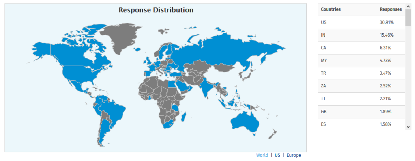
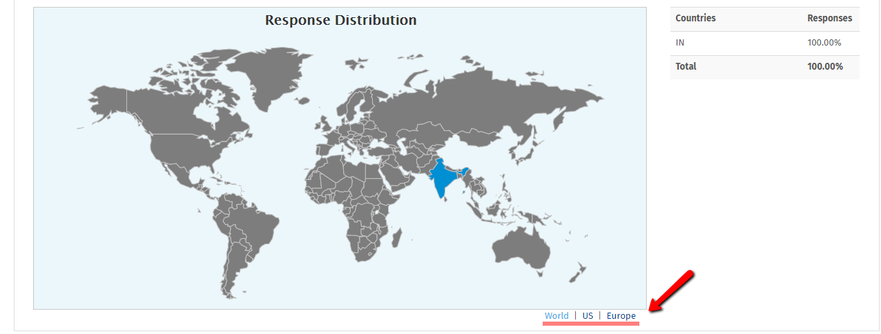
The map on the Dashboard report gives you a graphical representation of response distribution from all over the world. It highlights the area from where responses were captured and also gives you the stats of what percentage of responses were taken from that specific area?

At the moment we provide 4 different maps: US, Europe,Canada and World. You can change the map by clicking the option below the map.

The system captures the IP address of the respondent along with the response and based on that the area is identified.
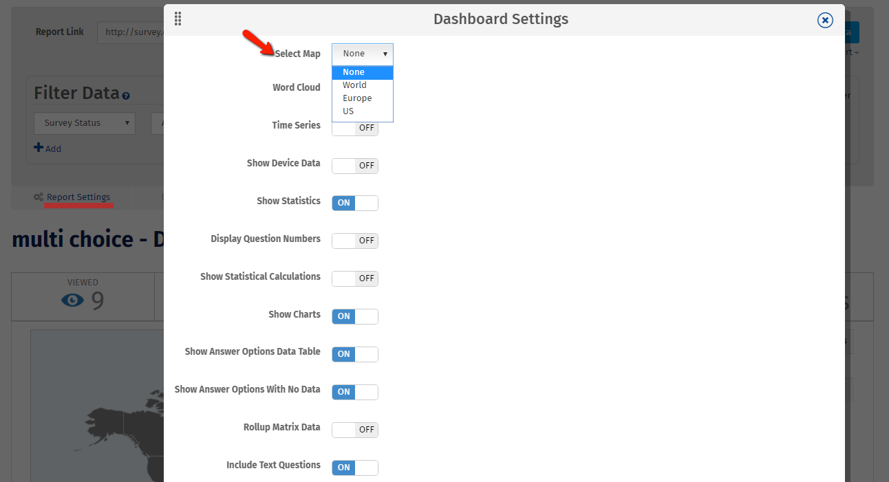
To display the map on the Dashboard report you will need to enable the option in the settings.
You could go to Login » Surveys » Reports » Basic >> Dashboard » Report Settings » Select map

This feature is available with the following licenses :

